
Formatting Your Manuscript for Kindle Direct Publishers
Trust Me. Start With KDP
I highly recommend using Kindle Direct Publishers for your maiden voyage into publishing. Unless you specifically want or need a print version of your book, it can be a good idea to see how the book does in ebook form before taking it to print. Formatting for a print book is a bit trickier and finding your feet with e-publishing first is a good option. Kindle Direct Publishers (KDP) is about as close to perfect as you can get in a publishing program. Yes, there is room for error, but if you search out KDP on the internet, you will find that there are relatively few complaints from authors when considered in relation to the literally tens of thousands of books they publish each year. I have personally never had a problem with KDP and have stuck with them faithfully with great results. It took me a while to learn how to master their formatting, but that was a matter of time and practice, plus elimination of a little over-thinking on my part.
Go to Kindle Direct Publishers (www.kdp.amazon.com) and set up an account with them. After your account is complete, you will have a “bookshelf” where you will manage your submissions. You can upload new books, change your cover or manuscript, and track your sales through this interface. Of course, there will initially be nothing there to see or manage until you begin your uploads.
Other ebook publishers use pretty much the same formatting as KDP.
Go to your MS Word/Open Office document that contains your “final” version of your manuscript. To prepare it for submission, you will need to make some global formatting changes but never fear! You will not have to make them manually, one at a time, thanks to the fabulousness of MS Word and Open Office.
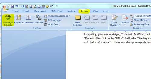
First, if you have not already done so, change the settings in your word processing program to correct for spelling, grammar, and style. To do so in MS Word, first click on the tab on the tool bar that says “Review,” then click on the “ABC Spelling and Grammar” button as shown below:
This will start your spell-check as is, but what you want to do now is change your preferences.
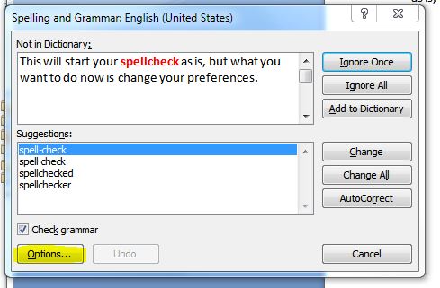
Click on the “Options” button highlighted above. This will open your list of options for MS Word Autochecking.
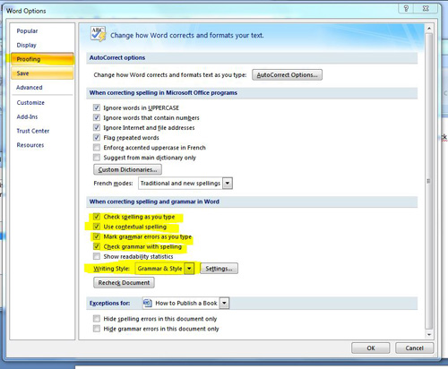
Make sure the “Proofing” pane is selected from the left sidebar menu. Set your options as above, particularly the highlighted items. Enable “Check spelling as you type,” “Use contextual spelling,” “Mark grammar errors as you type, and “Check grammar with spelling.” Set your writing style as “Grammar & Style.”
Click on “Settings” to the right of “Grammar & Style” next to “Writing Style.”
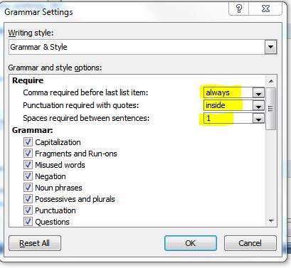
Set the first three options as highlighted above and then check to enable everything under “Grammar.” Click “OK” to save.
This is going to cause MS Word to get very bossy with you, but ultimately, will result in a tighter, better product. It will tell you when you are getting too wordy, at which time you should find a simpler way to express your message. It will tell you when you are using a passive voice, which does not read well due to how our brains interpret words. It will tell you when you are using sentence fragments. All of these points are ones you will learn more about if you read On Writing by Stephen King or take a good grammar course. Poor grammar, bad sentence structure, misspellings, and incorrect word usage are a quick ticket into the oblivion of identification as a mediocre, illiterate, careless writer.
Now that you have set your options, pick your way back through your book and look at the corrections the program made. Ideally, you will do this when you first start to write your book so you can make corrections as you go; however, there is a strong chance that by the time you pick up this book, you have already written your own. You will likely feel as though MS Word, that friendly, accommodating little word processing program, just grew batwings, horns, and became a domineering, cross old school marm with a thick ruler trained at your virgin knuckles. Remember that each time a little green or red wavy line shows up on your pristine document, it is an attempt to help you create a better product.
Parts of Your Book
Once you run through your proofing, it is time to set your overall formatting. This involves working with “Styles,” which is unfamiliar territory for most people unless they have done CSS coding in website development. Styles are a function designed to keep your formatting consistent throughout the varying parts of your book. You are going to have several different sections of the book to deal with in most cases:
– Your Cover: You will upload your cover as a separate file and it should not be included with your main ebook zip file. Do not insert your cover graphic into the MS Word document that contains your manuscript and interior graphics. You will upload two different files in the submission process: your cover and your manuscript. This will be accomplished in two separate areas of the KDP interface.
– Your “Front Matter”: Pick up any hard copy book. If you do not have any hard copy books within immediate access in your home, then I question your qualifications as a writer. (Seriously). Just as people who do not have children have no call to give parenting advice, people who do not read books have no business writing them. As you look through the print book, notice that the first printed pages are not part of the main manuscript. These usually consist of marketing pages with book quotes and reviews, an author information page (although I always put mine at the back of the book), the title page, the copyright page which also contains illustration credits, publisher information, Library of Congress data, a dedication page, an acknowledgements page, and a table of contents (TOC). After these “admin” pages, we move into the main manuscript of the book. These preliminary pages make up what we call “front matter.”.
– Your Headings: These are the titles of your chapters and additional manuscript sections such as “Introduction,” “Prologue,” “Epilogue,” “Appendices,” etc. You may also have subheadings to your chapters as well, especially in a non-fiction book. See below:
– Your “Normal” Print: This is the basic text of your main manuscript.
– Back Matter: This will typically include blank pages or marketing material, and possibly the “About the Author” or “Other Books By the Author” section. This is not usually included in the table of contents.
For your front matter, you may include any of the items listed in that section, in whatever order seems most logical to you. I always prefer to start out with a title page, then on to the copyright page, followed by an acknowledgement page or dedication page if I am using one, then the table of contents.
Your Title Page
Your title page is a secondary introduction to your book. In MS Word, there is even a style called “Title” in the style bar under the “Home” tab:
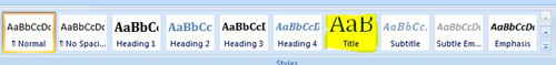
I recommend using it for your title page information, which should include your book title, the title of any series of which it is a part, the volume of that series the current book is, and your name as the author. When you type that information, highlight it, and click on “Title” (as highlighted above), it will transform that selected text into the style assigned to “Title,” which you can see on the text examples above
I would then choose to center the text, simply because I prefer how it looks, by highlighting it with my cursor and selecting the “center” button from the “Home” tab on the toolbar.
For my preferences, that would be the extent of my title page. Some authors like to include a small black-and-white graphic on their title page.
Your Copyright Page
A copyright page consists of a blurb identifying the author as the copyright holder for the manuscript and a statement of permission for any graphics used in the book. In a print book, the ISBN is also included on the copyright page. Here is the copyright statement for the first edition of my book Reuniting the Two Selves:
Text Copyright © 2013 Katrina Rasbold All Rights Reserved
Cover artwork is a faithful photographic reproduction of an original two-dimensional work of art by Antonio Palomino. The work of art itself is in the public domain for the following reason: This work is in the public domain in the United States, and those countries with a copyright term of life of the author plus 100 years or less. This file has been identified as being free of known restrictions under copyright law, including all related and neighboring rights.
The cover I used for that particular edition as found in Wikimedia Commons and was part of the public domain. For the book “CUSP,” I used a ton of photographs in the book, but they were all photos I took myself, so extensive photo credit was not needed.
I wrote the following:
Text Copyright © 2012 Eric and Katrina Rasbold All Rights Reserved
All photography and graphics within this text are the sole property of the authors
I own my own publishing company, so I will often also include the logo and credit for that company.
Inserting a Page Break
We have now identified content for the title page and the copyright page. Those are two separate pages in your book and we have signal the electronic reader that the page is to cut off even though the rest of the page has no text or graphics. Obviously, the copyright notice only takes up a tiny portion of the page but the rest is blank. Unless we inform the publishing interface that we wish to start a new page, the next page will continue directly under the copyright information.
Your reader needs a flexible reading platform that will accommodate e-readers of different sizes. When you publish an ebook, your reader might see it on a computer monitor, such as “Kindle for PC,” or if they are reading it in PDF form. They might see it on a Kindle, a Nook, or a Kobu, which are usually 5×7”. They might see it on an iPhone screen or on their Samsung Galaxy, which are very different in size.
If you depend on hitting “Enter” repeatedly until your MS Word documents hits the next page, you have likely just created multiple blank pages on an iPhone. Instead, you should use a “Page Break” to stop the page.
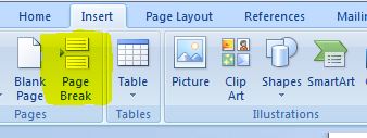
Do so by placing your cursor at the end character of the page you wish to end. Click on the “Insert” tab:
Then click on the “Page Break” button:
That will end the page at the point of the cursor and force your cursor to jump to a new page with a break in between. You must do this at the end of each chapter and after each separate page in your front and back matter. You do NOT insert a page break after each chapter subheading. For those, you will simply hit “Enter” and continue typing as usual.
Heading Styles
As you can see throughout this book and as described earlier in this chapter, there are usually different fonts used for chapter titles and subheadings within a manuscript. You can see that the heading “Heading Styles” above looks different than does the text for chapter titles. This is because of the use of “Styles.” You used one style, “Title,” to format the title and author of your book on your title page. Now, we will look at how to use styles to embellish the other areas of your book.
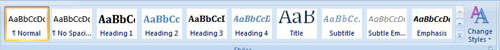
MS Word provides a standard set of styles as its default. You may access these through the Style menu bar on the “Home” tab as shown below:
You can change the styles for each section to look any way you wish. For instance, for my chapter headings, I like for my text to be all capital letters, black Cambria font, centered, and 14pt font weight:
LIKE THIS
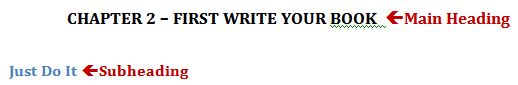
All I have to do to set my Heading 1 style is to type out my words:
CHAPTER 1 – RIDING THE WAVE
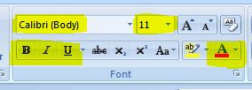
Notice that I have used the caps lock because I want the chapter to be in all caps. The style function will not affect capitalization. That is my standard, “Normal” text (more about that later in this chapter). Now, I will highlight those words and manually apply the changes I want to see. In this case, I want the font “Calibri” with a 14pt font weight. I also want the chapter heading to be bolded. With the text still highlighted, I set the font choice to Calibri and click on the “B” under “Calibri” for “Bold.” I want it centered, so I click on the “center” alignment tab in the section above the word “Paragraph.” I can also italicize the words, underline them, or change the color.
You can find all of these font functions on the “Home” tab as shown below:
With the text still highlighted, I go up to the Style menu bar, hover over “Heading 1,” right mouse click, and select “Update Heading 1 to match selection” from the right click menu that appears. This will cause anything I identify as “Heading 1” to look like the selection I have chosen. Through this use of “Styles,” my “CHAPTER 1 – RIDING THE WAVE” text becomes:
CHAPTER 1 – RIDING THE WAVE
…or whatever style I happen to have set as my Heading 1 style.
From this point on, all I have to do is type out my next chapter heading, highlight it, and then click on Heading 1 in the style menu to assign that style to the text.
Also, if at any time in my manuscript, I decide I want to change how my chapter headings look, I can go to a chapter heading, highlight it, make the changes I want, then right click on “Heading 1” and choose “Update Heating 1 to match selection.” When I alter the pre-sets of “Heading 1,” it will change every piece of text in the document that I assigned the “Heading 1” style. This keeps you from having to change every section individually.
After you have assigned the Heading 1 style to your new chapter heading, hit “Enter” and your cursor will automatically drop to the next line and resume the “Normal” style.
At this point, you might think that using styles to format your headings is too much trouble to learn and you would rather set them individually as you go. Unfortunately, when it comes time to insert your table of contents (one of the last things we will do to your book), MS Word will only categorize the headings to which you have assigned a style. Using styles keeps you from having to manually create the table of contents and in ebooks, you will need a linked table of contents for complete functionality, which is going to be much more of a pain in the butt to create than using heading styles.
For my chapter subheadings, I do the same thing, except in this case, I am happy with the style of Heading 2 and will use it as is.
Heading Styles, for instance, becomes
Heading Styles
…when I highlight it as “Normal” text and click on “Heading 2.”
Normal Style
The next and most important style is your “normal” text, which is the main text of your manuscript, such as the sentences you are reading right now. And now. And now. For any of your styles, regardless of how expressive and flamboyant you feel, you will want to choose standard fonts so that they will translate out well onto the e-reader of the person who was interested enough to purchase your book. Using non-traditional fonts requires that you embed your new font into your manuscript. You can avoid this rather complicated step by using only traditional fonts such as Cambria, Calibri, Times New Roman, Arial, etc. Honestly, using the preset default styles that come with MS Word will serve you perfectly fine. Explore them and see what works for you. You are still free to use emphasis such as bold text, italics, and underlining.Using styles in the main parts of your manuscript does not prevent you from using those functions for emphasis.
You may also use the “right indent” button to emphasize an extended quote from a source as shown here:
Use the “left indent” button to the left of the right indent button to get back to your non-indented format.
Another helpful way to set off text you want to emphasize is the use of borders. The border button is show below and can be found on the “Home” tab of the MS Word toolbar.
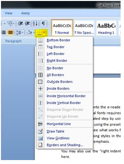
Simply insert a right and left border to isolate specific text you want to set apart from the rest of the manuscript, as you see here.
For your normal text, you will likely want to use 10, 11, or 12 pt text. I like to go right down the middle with 11 pt text.
You will also need to consider indentation, alignment, and line spacing, which are paragraph functions that your “Normal” style will affect.
As with the style of headings, you may adjust the presets for your “Normal” style according to your submission guidelines and personal preferences. The standard for “Normal” style varies by whether you are writing fiction or non-fiction books.
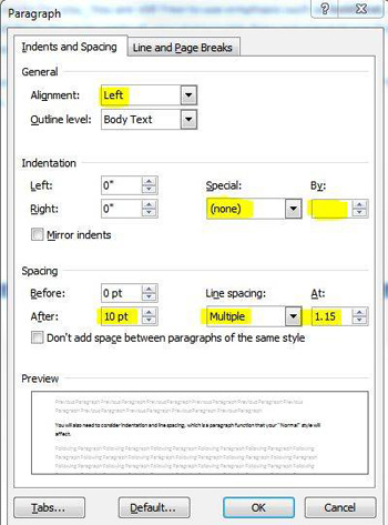
The Normal style for non-fiction books is no indentation of the first word of each paragraph and a larger space between each paragraph than you had within the paragraph. That is how this book is set up. You will notice that the additional space between paragraphs is what signals your brain that a new paragraph has started.
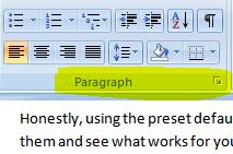
To achieve this globally on the “Normal” style, set your cursor at the beginning of one of your “regular” paragraphs in your manuscript. After you have done so, click on the tiny, downward right pointing arrow next to the word “Paragraph” on the “Home” tab:
That will open the following dialog box:
The first box is for “Alignment.” You may choose whether to leave the right margin of your paragraph “ragged” or change it to “justified.” When a paragraph is “justified,” MS Word adds extra spaces in between the letters to force the paragraph into a perfectly boxed shape like this:
“Non-fiction is a different beast, but it still needs room to grow and to tell you what it wishes to become. My husband said something to me that changed the way I viewed my own writing: “When you write non-fiction, all you have to do is remember the truth. When you write fiction, you have to remember all of the lies you told.”
The italics and side borders are for emphasis only. You can see that the characters on the right side of the paragraph are all flush against the right margin.
When a paragraph is “ragged,” the right margin is uneven and the characters fall naturally, like this:
“Non-fiction is a different beast, but it still needs room to grow and to tell you what it wishes to become. My husband said something to me that changed the way I viewed my own writing: “When you write non-fiction, all you have to do is remember the truth. When you write fiction, you have to remember all of the lies you told.”
You can clearly see the difference between the two formatting choices. Most book publishers opt for justified alignment for both fiction and non-fiction manuscripts. In the “Alignment” box above, you can choose “Left,” which will leave the right edge ragged, or “Justified,” which will creating the blocking off effect you see in the first example.
For the standard non-fiction formatting (non-indented paragraphs, space between paragraphs), you would set your preferences as shown in the highlighted sections of the previous graphic. Click “OK” to accept.
In fiction and novel writing, the style is typically an indented first line and no space between paragraphs. Using both the indentation and the larger line spacing between paragraphs is truly a rookie move. Pick one and stick to it throughout your book.
To set your preferences for the standard fiction/novel line spacing, your options would be selected as seen below in the highlighted sections:
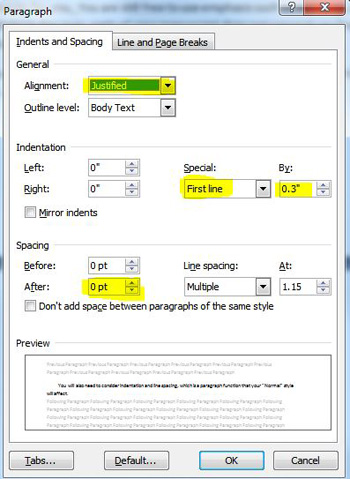
The alignment may still be set to either “Left” or “Justified” as is your preference. Under “Special,” select “First line” from the drop down menu and choose “0.3” under “By:” Some tutorials suggest using 0.5” paragraph indentions, but I find them to be too dramatic of an indentation on an e-reader. Make sure the “After” option under “Spacing” is set at 0 pt. Click “OK” to accept.
Once you have clicked “OK” to finalize your alignment and line spacing, you may change your font and font size if you desire. When you are satisfied with your standard manuscript font, place your cursor inside a “Normal” paragraph and right click on “Normal” in the style menu. Choose “Update Normal to Match Selection.” This will cause all of your primary text to take on the specifications you just set up.
Any images you insert into your manuscript automatically adopt the “Normal” style setting. If you alter your “Normal” style setting after you insert images, the alignment of the images will change to the new “Normal” alignment and move left if you previously centered the image. Simply realign the images to “centered” if that is your preference.
Finalizing Your Manuscript Package
By now, you should have…
– …completed your book in its final, perfect, amply proofed, and edited version to the point that you are totally sick of looking at it. All photos should be in place in the manuscript using the “Insert” tab on the toolbar (not by cutting and pasting).
– …set all of your styles for each part of the book, including title page, Heading 1 for chapter titles, Heading 2 for chapter subtitles, and Normal for your standard manuscript text.
– …separated each section and chapter by a page break rather than additional line spaces (hitting the “Enter” key).
Take Out Extra Spaces
Typing classes often train students to add two spaces at the end of each sentence. In publishing, however, we only use one. Rather than retraining yourself, it is a simple process to remove the extra space between sentences.
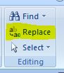
Hold down the Ctrl button on your computer keyboard and click the A key on your keyboard. This will highlight your entire manuscript. With the text still highlighted, go to the Home tab of the toolbar and click on “Replace” at the far right end of the toolbar:
That will open the following screen:
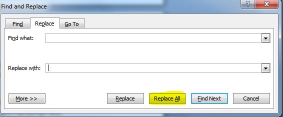
After “Find what:” type two spaces, then go to “Replace with:” and type in one space. Of course, you will not actually see the spaces you insert into those fields. Click on “Replace All.”
Ba-Bam! All of your double spaces cover to single spaces.
Check Your Line Spacing Visually
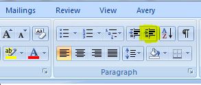
Setting the options on your “Normal” style and using page breaks to separate pages should theoretically manage your line space formatting. To be sure, click on the Paragraph icon on your toolbar (NOT the arrow by the word “Paragraph”):
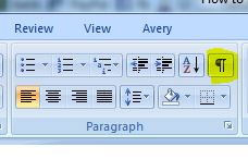
Toggling the paragraph button will cause the icon you see on the button to show up all through your manuscript. This will possibly be terrifying at first, but it will help you easily see where you have extra lines that do not belong in the book. There should be ONE (1) of those little marks after each paragraph or graphic. If there are extras, remove them to keep your line spacing consistent throughout your manuscript. Once you have done this, you may click on the paragraph button again to toggle the function off and return you to your regularly scheduled, non-glyphic wonderful book.
Insert Your Table of Contents
Readers depend on a table of contents (TOC) to assist in navigating through a nonfiction book. A table of contents is optional in a fictional book/novel.
For an ebook, the TOC is clickable and links to chapter headings and subheadings depending on your set preferences. MS Word, fortunately, has a built-in function to automate the TOC construction.
Go to the section where you want to place your TOC. This should be after the primary front material and before the main text of your book, including any introduction. Insert a page break after the last character of the previous page.
At the top of the new page, type TABLE OF CONTENTS. You may stylize that text with either “Styles” or simply by bolding, changing text size, etc. Remember that if you choose “Heading 1” or “Heading 2” to stylize your TOC title, it will be included in your Table of Contents, so avoid those specific styles.
Hit “Enter” so that your cursor is below the words “Table of Contents” that you just typed.
Click the “References” tab on your toolbar. (I know. I was thinking it would fall under “Insert” as well)
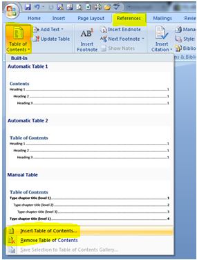
Click the tiny “down” arrow next to the words “Table of Contents.” Go all the way down to the bottom of the list and select, “Insert Table of Contents.”
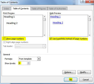
Uncheck “Show page numbers” as seen in the highlighted section above. Check “Use hyperlinks instead of page numbers.” Choose 1 or 2 for “Show levels” If you choose 1, only chapter headings (Heading 1) will be included. If you choose 2, chapter subheadings (Heading 2) will be included in the TOC. Click “OK.”
Like magic, your TOC will appear. Make sure there is a page break after the TOC. Your TOC will now include links to the chapters and subchapters you have identified with Heading 1 and/or Heading 2.
You always insert your TOC last in the formatting and editing process to be certain any changes are included and accounted for appropriately.
Re-insert Your Graphics
This is going to sound like a colossal waste of time and energy, but ultimately, it will save you a lot of grief simply because of the format Kindle Direct Publishers requires for submission (a zipped up filtered html document).
Go through your manuscript completely from front to back, serially, no backtracking, no graphic moving, no cutting it out here and pasting it in there. From start to finish, go through your book and re-insert every graphic, every photo, every illustration in order from your computer files and make sure they are aligned as you desire (centered, etc).
These steps should bring your manuscript to completion for Kindle Direct Publishing submission. You will need to format the manuscript quite differently for submission to Createspace for print publication as opposed to e-publication.
Saving and Zipping
***PLEASE NOTE THAT YOU DO NOT HAVE TO ZIP YOUR FILES IF YOU HAVE NO IMAGES IN YOUR MANUSCRIPT! If you have a book that is TEXT ONLY, you may simply upload the .doc or .docx file created by MS Word to KDP. If you have ANY images included in your manuscript (including an author photo), you will need to zip the files as described below.
When you upload your manuscript, you need to do so as one file. This means you have to bundle up your MS Word document plus all of your graphics into a zip file to upload to KDP. After you re-insert your graphics and are completely satisfied with your manuscript format, click on the office button…

…in the upper left hand corner of the window and choose “Save as” from the drop down menu.
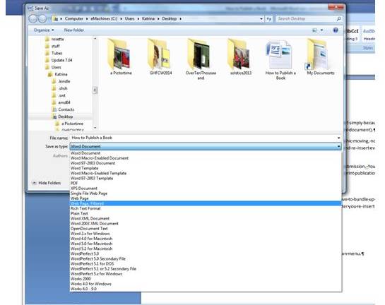
From the “Save as” drop down menu, choose “Web Page, Filtered” and save it to your desktop or where ever you intend to put it. You will possibly get a couple of prompts telling you about how it will be saved and what may be lost. Just click through those.
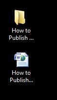
Once you have saved your manuscript as a filtered web page, you will have TWO items in your save location. For demonstration purposes, I saved my files to my desktop. One is a folder of files and one is the html file that you just created. Below, the folder of files is the top icon and the html file is below it.
Next, you will zip up the folder. Do that by right clicking on the folder (top icon) and choosing “Send to” and then “Compressed Zipped Folder” from the expandable menus as seen below.
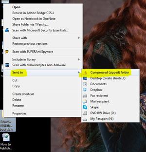
That will create a zip file (compressed folder) in the same location as the original folder. When you upload this zip file in the submission process, KDP will unzip it and read the contents for processing. You now have three items in the save location:
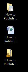
The bottom one is your zip file. Now, drag the html file (on the example above, it is the middle file) into the zip file using your mouse cursor. It will drop right in there if you drag and drop it.
Now, you have formatted your book and you are almost ready to submit it for publication. Please note that Kobu, Nook, and iTunes use a very similar process for formatting manuscripts for upload to their programs.